

8 Restaurant Website Design Ideas That Drive More Orders
Your restaurant's website is doing one of two things: bringing in orders or pushing customers toward third-party apps that take 30% of every sale. The difference usually comes down to design. Not just how a site looks, but how it functions, guides visitors, and removes friction between "I'm hungry" and "order placed." Good restaurant website design ideas start with understanding what actually makes people click that order button.
We built The Foody Gram to help restaurants own their online ordering, no commissions, no middlemen, just direct orders through a branded website you control. That means we've seen firsthand which design choices lead to more orders and which ones quietly kill conversions. Every idea in this list comes from real patterns we've observed across hundreds of restaurant websites.
Below, you'll find eight design approaches that go beyond aesthetics. Each one is tied to a specific outcome: faster ordering, stronger branding, or higher average tickets. Whether you're building your first restaurant website or rethinking an existing one, these ideas give you a concrete starting point, not vague inspiration.
1. Build your site around direct online ordering
Most restaurant websites treat ordering as one of many options buried in a navigation menu. That's a conversion killer. When someone lands on your site hungry, every extra click is a chance they leave and open DoorDash instead. Your site should be built from the ground up with one primary goal: getting that visitor to place an order directly with you, not routed through a platform that takes a cut of the sale.
Why this idea increases orders
Third-party apps have spent billions optimizing their ordering experience. When your own site makes ordering feel harder or slower, you lose that comparison instantly. Direct ordering means you keep 100% of the revenue from each transaction rather than surrendering 25-30% to a platform. Beyond the money, every direct order builds your customer relationship rather than the app's. You collect the contact data, you control the follow-up, and you own the repeat business.
The simplest way to compete with third-party apps is to make your own ordering experience faster and easier than theirs.
Design and UX pattern to copy
Place your "Order Now" button in the top right of your navigation and repeat it as a large primary call-to-action in the hero section, right below your restaurant name and a one-line description. This gives visitors two immediate chances to start an order before they scroll. Keep the path from landing page to checkout under three clicks by loading menu categories directly from that button, with no extra landing pages or promotional overlays in between.
Content to include and where it goes
Your hero section needs a clear headline that names what you serve and where you're located, like "Authentic Tacos in Denver." Directly below that, place your "Order Now" and "View Menu" buttons side by side so neither option gets buried. Your pickup and delivery choices should appear on the same screen without scrolling, so customers know what's available before they commit to starting an order.
Quick checklist
Run through these before moving on:
- "Order Now" appears in the navigation on every page
- Hero section has a direct order CTA above the fold
- Menu loads in one click from the order button
- Pickup and delivery options are visible before checkout begins
- No splash screens or pop-ups block the path to ordering
2. Use a web-first menu that people can scan
PDF menus are a dead end. Visitors pinch, zoom, and struggle to read them on a phone, and most leave before they even find what they want. A web-first menu displays your items in a clean, scrollable format that works instantly on any screen without forcing a download or opening a second app.
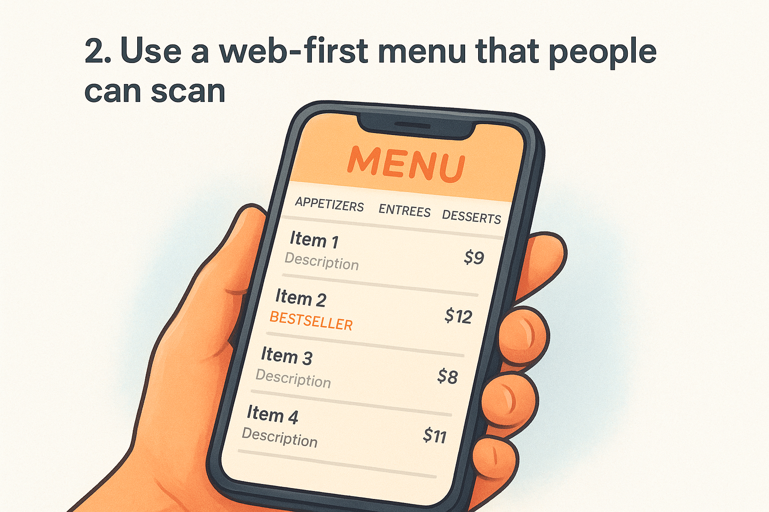
Why this idea increases orders
When someone can scan your menu in under 30 seconds, they move faster toward a decision. A hard-to-read menu creates doubt and friction, and doubt sends people back to Google to find a competitor. A web-first menu also lets you update prices and items instantly without reprinting or re-uploading a file every time something changes.
A menu that loads fast and reads clearly is a direct conversion tool, not just a reference document.
Design and UX pattern to copy
Organize your menu into clear categories displayed as tabs or anchor links at the top so visitors jump directly to what they want. List each item with a name, short description, and price on a single line. High-margin items benefit from a photo, but every item does not need one; too many images slow down load time and clutter the layout.
Content to include and where it goes
Each item description should be one to two sentences focused on ingredients and flavors rather than marketing language. Place your most popular category first, and mark your bestsellers with a simple label so new visitors get a quick recommendation without having to think.
Quick checklist
- Menu is HTML-based, not a PDF
- Categories are visible without scrolling
- Each item shows name, description, and price
- Bestsellers are labeled prominently
- Menu loads in under two seconds on mobile
3. Keep the order and reserve buttons always visible
Visitors land on your site at different points in their decision process. Some are ready to order immediately; others want to check hours or book a table first. If your "Order Now" or "Reserve a Table" buttons disappear once someone scrolls past the hero, you're forcing them to hunt for the action you most want them to take.
Why this idea increases orders
A sticky navigation bar that holds your primary action buttons throughout the entire page removes the moment of hesitation that kills conversions. When the button is always one click away, your visitors never have to backtrack. This is one of the most underused restaurant website design ideas because it looks simple, but the impact on completed orders is significant.
Keeping your order button visible at all times is the closest thing to a guaranteed conversion improvement you can make without touching your menu or pricing.
Design and UX pattern to copy
Use a fixed header that stays at the top of the screen as visitors scroll. Keep it slim so it does not block content, and include only your logo, a navigation link or two, and your "Order Now" button in a high-contrast color that stands out from the background. On mobile, pin an order button to the bottom of the screen where thumbs naturally rest.
Content to include and where it goes
Your sticky header button needs three words or fewer, such as "Order Now" or "Order Online." For restaurants that take reservations, add a second button labeled "Reserve a Table" next to it so both actions stay accessible without competing for attention.
Quick checklist
- Header stays fixed while scrolling on both desktop and mobile
- Order button uses a color that contrasts with the header background
- Mobile layout includes a pinned bottom bar with the order button
- Button copy is short, clear, and action-oriented
- Reserve and order options appear together without cluttering the header
4. Use photography that sells the vibe and the food
Visitors form an impression of your restaurant within seconds of landing on your site, and bad photos can undercut even the best menu. Blurry images, stock food photos, or dark, poorly lit shots signal low quality to a potential customer before they read a single word. Strong photography is one of the most overlooked restaurant website design ideas because owners assume it requires a big budget, but a few well-executed shots change the entire feel of your site.
Why this idea increases orders
Good food photography removes uncertainty. When a customer can see exactly what they're ordering, they feel more confident clicking "add to cart." A single hero image showing your best dish can do more conversion work than a paragraph of description. Atmosphere photos give first-time visitors a reason to trust your brand before they even read your menu.
A great photo of your food does the same job as a recommendation from a friend.
Design and UX pattern to copy
Place your strongest food photo as the hero background image on your homepage rather than a generic restaurant interior shot. Use natural light whenever possible, and shoot dishes at a slight angle to show depth. Limit your total image count to the shots that genuinely make the food look irresistible rather than filling space with mediocre extras.
Content to include and where it goes
Lead with two to three high-quality dish photos near your menu or order section so visitors see the food right before they decide to order. Include one atmosphere shot that shows your dining space or packaging for delivery orders.
Quick checklist
- Hero image features your best-selling dish, not a stock photo
- Photos are well-lit and sharp on mobile screens
- Atmosphere shot is included above the fold or just below it
- Total image count stays focused, not exhaustive
- Images are compressed so they do not slow page load
5. Design a thumb-friendly mobile layout
More than 60% of restaurant website traffic comes from mobile devices, and most of that traffic uses a thumb to navigate. If your buttons are too small, your text too dense, or your ordering flow requires pinching and zooming, you're losing orders to frustration before a visitor ever reaches your menu.
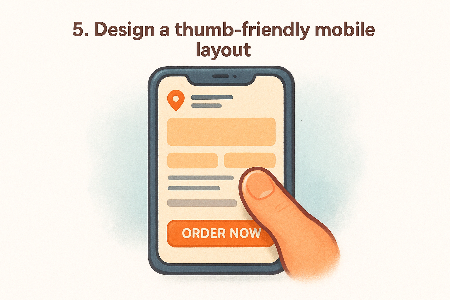
Why this idea increases orders
Mobile visitors are often deciding in the moment, standing in line, sitting in a car, or walking down a street. The faster your site responds to a thumb tap, the better your chance of converting that impulse into an order. Restaurant website design ideas that ignore mobile layout cost you the customers who are most ready to buy right now.
Design and UX pattern to copy
Stack your content in a single vertical column so visitors scroll rather than swipe sideways or zoom in. Make every tappable element, including buttons, menu items, and phone numbers, at least 44x44 pixels, which is Google's recommended minimum tap target size for mobile interfaces.
A thumb-friendly layout is not a stripped-down version of your desktop site. It is your primary design.
Content to include and where it goes
Your phone number, address, and hours should appear near the top of your mobile layout since local searches frequently come from someone who wants to call or visit immediately. Place your order button within thumb reach at the bottom of the screen rather than locked in a header that requires stretching to reach.
Quick checklist
- All buttons are at least 44x44 pixels
- Content stacks in a single column on mobile
- Phone number and address appear near the top
- Order button is pinned to the bottom of the mobile screen
- No horizontal scrolling on any screen size
6. Make speed part of the design
Page load time is not a technical problem you hand off to a developer. It is a design decision that shapes every visitor's first experience with your restaurant. Slow pages cost you orders because hungry customers do not wait more than a few seconds before opening a competitor's site.
Why this idea increases orders
Google's research shows that as page load time goes from one second to three seconds, the probability of a bounce increases by 32%. For a restaurant, every bounce is a lost order. Among the most direct restaurant website design ideas you can apply, speed optimization delivers results you measure in order volume, not just technical scores.
A visitor who leaves because your page loaded too slowly will not come back to give you a second chance.
Design and UX pattern to copy
Two changes alone cover most of your speed gains on a restaurant site:
- Compress every image and use WebP format instead of JPEG or PNG to cut file sizes without losing quality
- Limit third-party scripts to essentials only, since each extra script adds measurable load time that visitors feel even when they cannot name the cause
Content to include and where it goes
Your homepage and ordering page carry the most traffic, so those two pages need to load the fastest. Avoid auto-playing videos and oversized background images on either one. Static text with compressed images loads quickly and handles the conversion work without slowing the experience.
Keep your ordering page especially lean. Unnecessary animations and overlays add load time right at the moment a customer is most ready to place an order.
Quick checklist
Run these checks before you move to the next section:
- Images are in WebP format and compressed before upload
- No auto-playing video on the homepage or order page
- Third-party scripts are limited to essentials only
- Homepage loads in under two seconds on a mobile connection
- Order page has no unnecessary animations or overlays
7. Add local signals and trust cues on every page
People who find your site through a local search are already close to a decision. They want confirmation that your restaurant is real, reliable, and nearby. Without local signals and trust cues visible on every page, you leave that doubt unresolved, and doubt sends visitors somewhere else.
Why this idea increases orders
Local signals tell search engines and visitors alike that you serve a specific area. When someone searches "pizza near me" and lands on your site, seeing your neighborhood name, city, and a real address immediately confirms they found the right place. Customer reviews and ratings reinforce that trust by showing real people have eaten your food and came back to say something about it.
Visitors trust a restaurant more when the site shows exactly where it is, who runs it, and what other customers think.
Design and UX pattern to copy
Place your full address and phone number in the footer of every page, not just the contact page. Add a short block of three to five recent customer reviews near your order section so visitors see social proof right before they commit to ordering.
Content to include and where it goes
These restaurant website design ideas work best when the signals are specific rather than generic. Use your actual neighborhood name, not just the city. Include a Google Maps embed on your contact page so visitors confirm your location without leaving your site.
Quick checklist
- Address and phone number appear in the footer on every page
- Three to five reviews are placed near the order section
- Your neighborhood name appears in at least one heading
- Google Maps embed is live on your contact page
- No page is missing your business hours
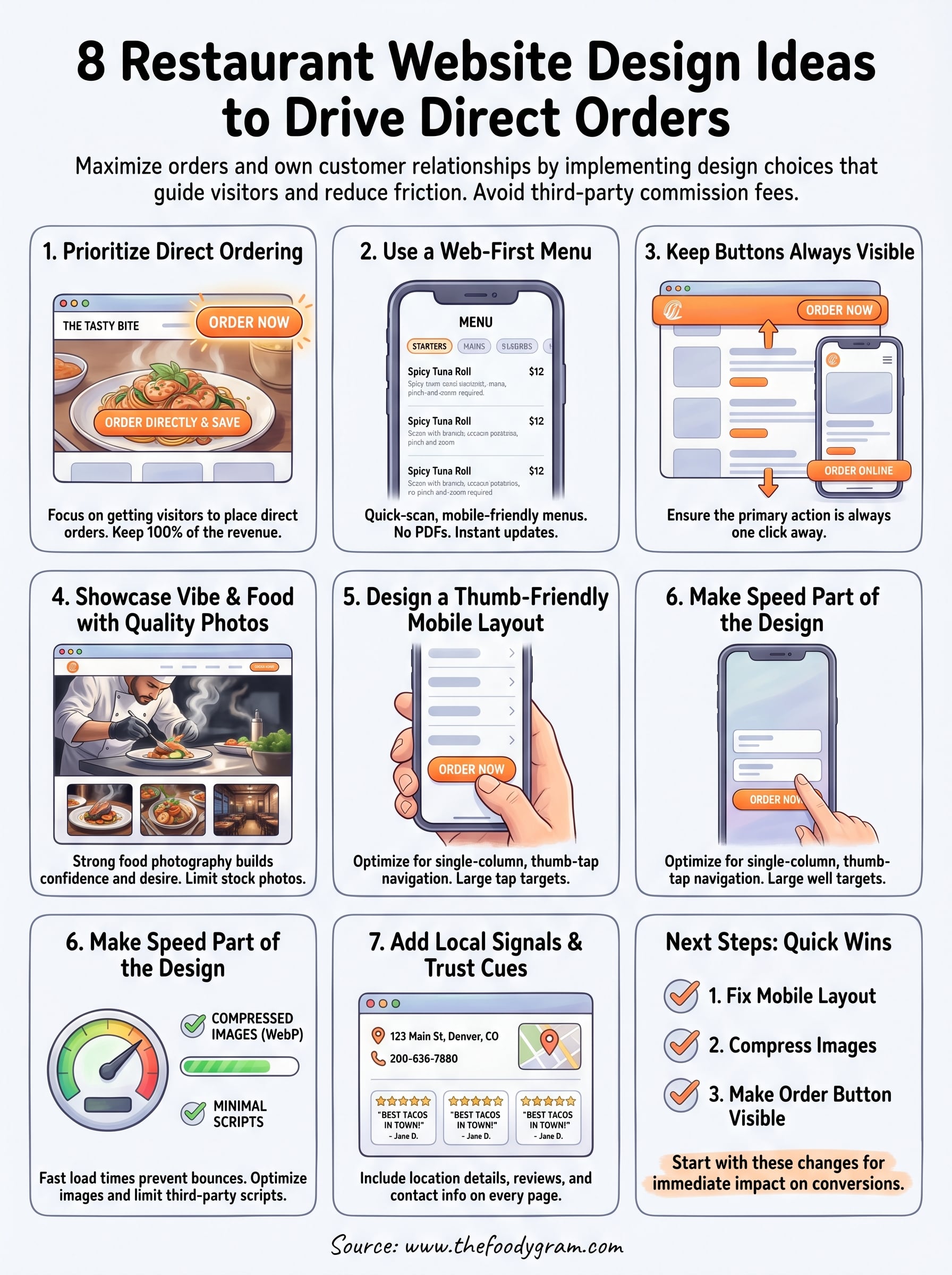
Next steps for your site
These restaurant website design ideas work because they remove friction between a hungry visitor and a completed order. Each one targets a specific point where customers drop off, and applying even a few of them will move your site closer to becoming your highest-performing sales channel.
Start with the changes that take the least time but pay off the fastest: fix your mobile layout, compress your images, and make your order button visible at all times. Those three alone cover the majority of conversion losses most restaurant sites experience.
Once your site is built around direct ordering, the next step is choosing a platform that supports it without charging you a cut of every sale. The Foody Gram gives you a branded, commission-free ordering experience with a flat monthly rate and no contracts. Check out our pricing and what's included to see what fits your restaurant.