

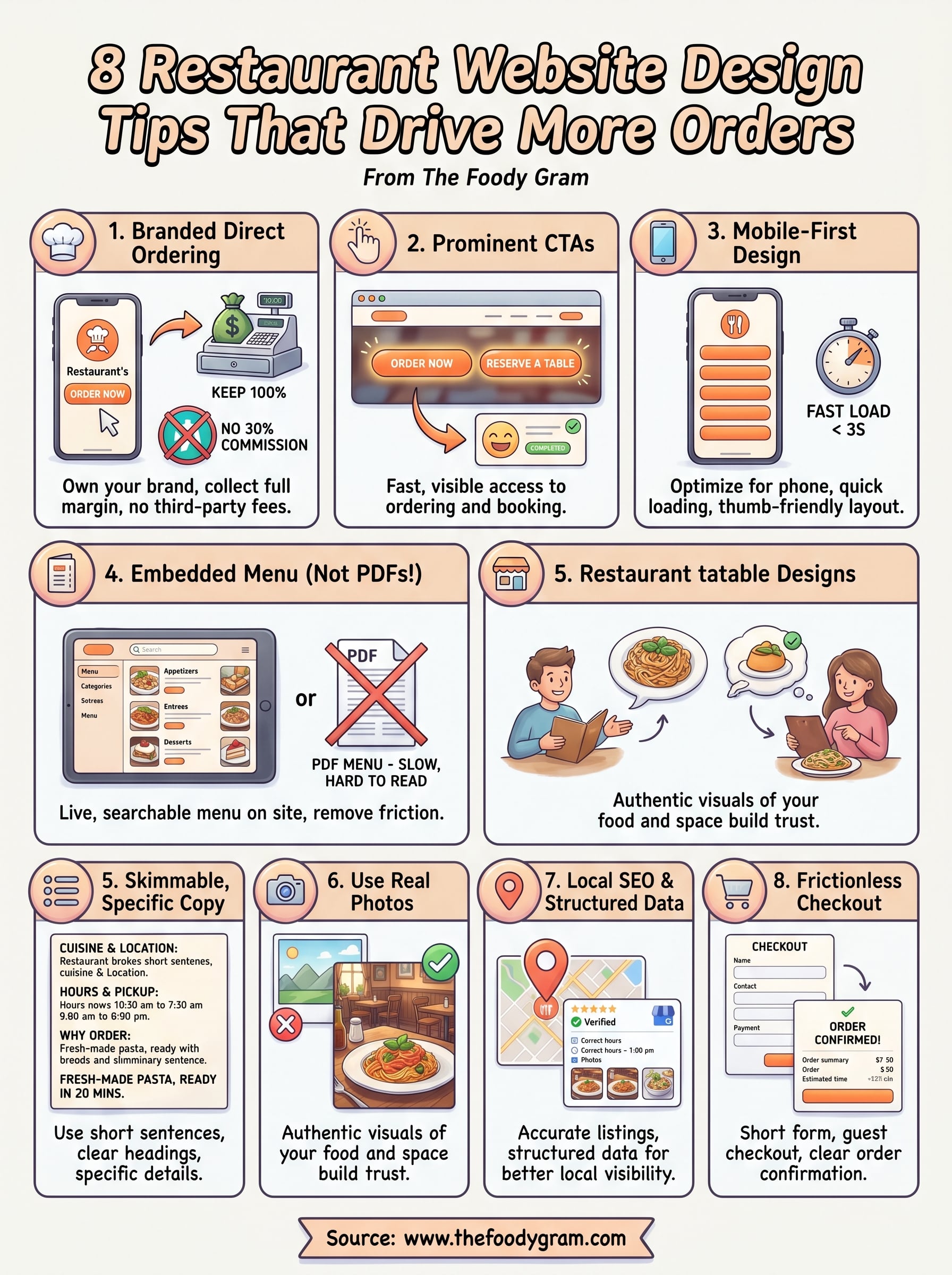
8 Restaurant Website Design Tips That Drive More Orders
Your restaurant's website is doing one of two things right now: bringing in orders or turning them away. There's really no in-between. A clunky layout, a buried menu, or a slow-loading page is all it takes to send a hungry customer straight to a competitor, or worse, to a third-party app that skims 30% off every sale.
Good restaurant website design tips aren't about making things pretty. They're about removing friction between a customer's craving and their completed order. The restaurants pulling in the most online orders aren't necessarily the ones with the biggest budgets, they're the ones whose websites make ordering feel effortless.
At The Foody Gram, we build commission-free ordering websites for restaurants every day. We've seen firsthand what separates a site that collects dust from one that drives consistent revenue. The patterns are clear, and most of the fixes are simpler than you'd think.
This article breaks down eight design tips that directly impact how many orders your restaurant website generates. Each one is practical, proven, and something you can evaluate on your own site today, whether you're building from scratch or looking to squeeze more out of what you already have.
1. Build a branded site with direct ordering
Your brand is already built in your customers' minds through your food, your space, and your service. Your website needs to match that identity and give visitors a direct path to order from you, not from a third-party platform that takes a cut of every transaction.
What to do
Start with a website that reflects your restaurant's actual brand: your logo, colors, and tone should be consistent from the homepage through checkout. Avoid generic templates that could belong to any restaurant. More importantly, your ordering system needs to live directly on your site, not redirect customers to Uber Eats or DoorDash. Every order placed through a third-party platform costs you roughly 25-30% in commission fees before you factor in any other expenses.
The goal is straightforward: a visitor lands on your site, sees your brand, finds the menu, and places an order without ever leaving your domain. Direct ordering keeps the entire transaction in your control, which means you collect the payment, you own the customer data, and you keep your full margin.
Why it drives more orders
When customers land on a branded, professional website, trust increases immediately. A polished site signals that you take your business seriously, and that signal converts browsers into buyers. Customers are far more likely to complete an order on a site that feels familiar and intentional than on a generic page with mismatched fonts and stock photos.
Customers who order directly through your website are also more likely to return, because you own their contact information and can reach them with promotions, updates, or loyalty offers.
Beyond trust, removing third-party apps from the equation means your prices can stay competitive. You're not forced to inflate menu prices to absorb platform commissions, which is one of the most common reasons restaurants quietly lose repeat customers over time.
Implementation checklist
Before moving on to the next restaurant website design tips in this list, confirm these basics are in place:
- Your logo and brand colors appear consistently across every page
- Your ordering system is embedded directly on your site, not linked out
- No external ordering platform links substitute for direct ordering
- Payment processing deposits funds directly into your account
- Your domain name clearly reflects your restaurant's name
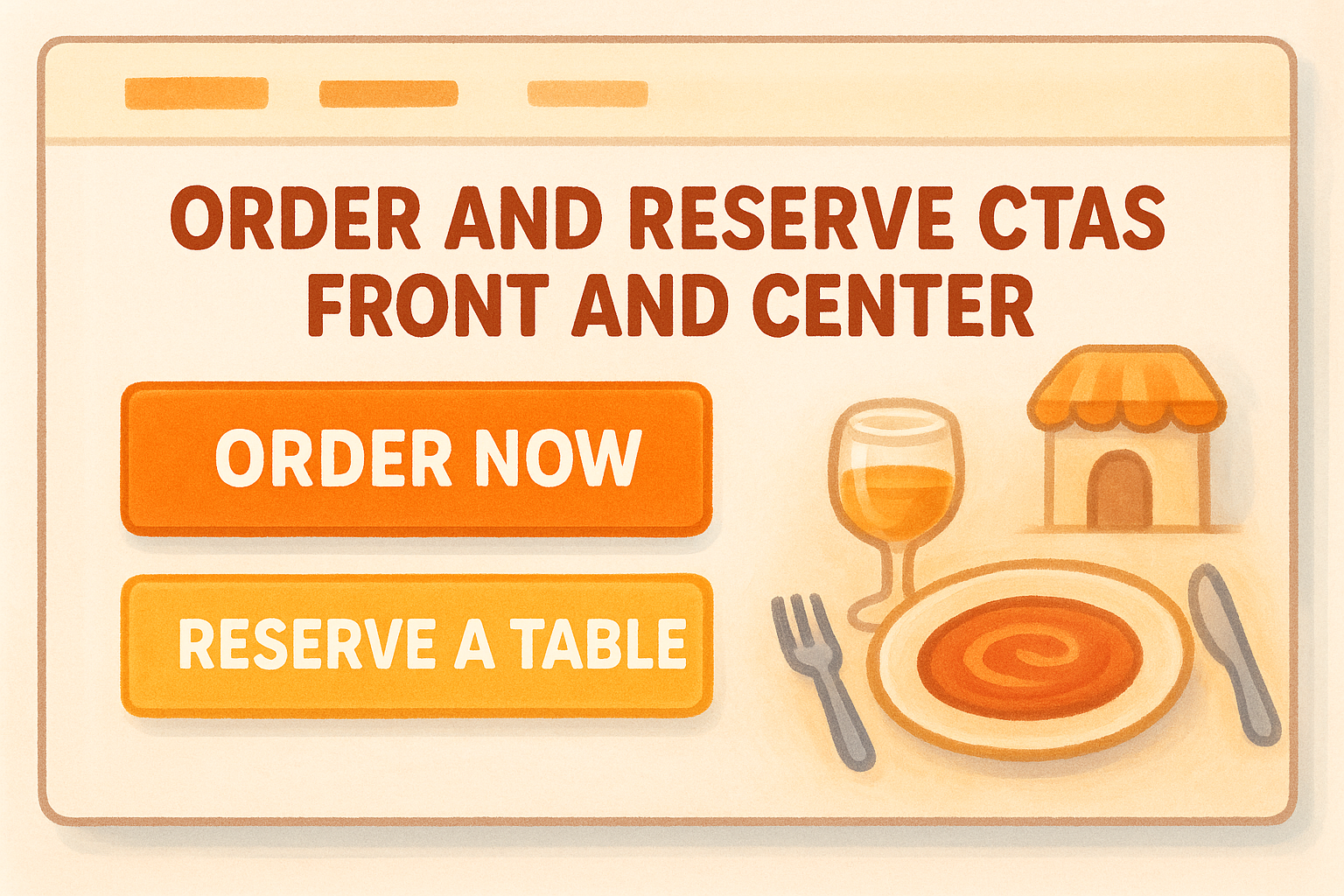
2. Put order and reservation CTAs front and center
A CTA that's hard to find is a CTA that doesn't work. If a visitor has to scroll or hunt for your "Order Now" button, most of them won't bother. Prominent CTAs are one of the most overlooked restaurant website design tips, and they carry a direct impact on your conversion rate that few other design choices can match.
What to do
Place your "Order Now" and "Reserve a Table" buttons where visitors can see them immediately, without scrolling. Use high-contrast colors so the buttons stand out clearly from the rest of your page. Consider these key placement spots:
- Header, visible on every page
- Above the fold on your homepage
- Directly after your menu section
- Near your hours and location info
Why it drives more orders
People make fast decisions online. When a customer is hungry or planning a visit, they want the path forward to be obvious. A buried CTA introduces friction, and friction kills conversions. The fewer clicks that sit between a customer's intent and their completed order, the higher the likelihood they actually follow through rather than giving up or going elsewhere.
The easier you make it to order or book, the more customers will actually do it.
Implementation checklist
Use this checklist to confirm your CTAs are visible and your ordering path is clear before moving on.
- "Order Now" button appears in the header on every page
- "Reserve a Table" CTA is visible above the fold on your homepage
- CTA buttons use colors that contrast clearly with your background
- CTAs repeat after the menu and near your contact and hours section
3. Design mobile-first and hit fast load times
More than half of all restaurant web traffic comes from mobile devices, and that number keeps climbing. If your site isn't built to work on a phone first, you're already missing orders, no matter how well you've applied every other restaurant website design tip on this list.
What to do
Design your layout so it looks and functions perfectly on a small screen before optimizing for desktop. Text needs to be readable without zooming, buttons easy to tap with a thumb, and your menu should scroll cleanly without horizontal shifting. On the technical side, compress your images and cut heavy scripts that drag your page load speed down. Google recommends keeping load times under three seconds for mobile users.
Why it drives more orders
Slow, broken mobile experiences push customers directly to a competitor. A one-second delay in load time can cut conversions by up to 7%, and a layout that breaks on mobile signals to visitors that your site isn't ready to handle their order.
If your site loads fast and looks clean on a phone, you eliminate one of the most common reasons customers abandon an order before completing it.
Implementation checklist
Run through these checks to confirm your mobile experience is solid before moving forward to the next section:
- Site renders correctly on both iOS and Android
- CTAs and buttons are large enough to tap without error
- Images are compressed and load quickly
- No horizontal scrolling on any screen size
- Page load time stays under three seconds
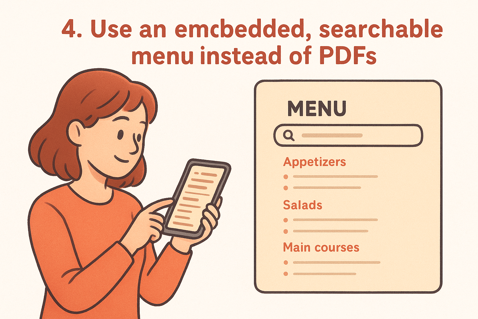
4. Use an embedded, searchable menu instead of PDFs
PDF menus are a relic that actively cost you orders. When a customer has to download a file, pinch-zoom to read it on their phone, and then navigate back to find a way to order, most of them give up before completing the process. Embedded menus solve this immediately by keeping your food, your ordering flow, and your brand all in one place.
What to do
Replace any PDF menus with a live, embedded menu that loads directly on your site. Organize items into clear categories so customers can scan quickly, and make sure the menu reflects your current offerings without outdated prices or sold-out items. When paired with a direct ordering system, your embedded menu becomes a conversion tool, not just an information page.
Why it drives more orders
An embedded menu removes a full layer of friction from the ordering process. Customers can read it on any device without downloading anything, tap directly from a menu item to checkout, and trust that what they see is actually available. PDF menus also block search engines from reading your menu content, which means you lose potential organic traffic from people searching for specific dishes in your area.
A searchable, embedded menu turns a passive visitor into an active customer faster than any other single design change you can make.
Implementation checklist
Confirm these points as part of your broader restaurant website design tips review:
- PDF menu links are fully replaced with an embedded menu
- Menu items are organized by category and easy to scan
- Prices and availability are current and accurate
- Customers can tap directly from menu items into your ordering flow
5. Make your copy skimmable and specific
Most restaurant website visitors don't read, they scan. They're looking for specific signals: what kind of food you serve, where you're located, when you're open, and how fast they can order. If your copy buries those signals in long paragraphs or vague language, visitors leave before they find what they need.
What to do
Use short sentences and clear headings to break up every block of text. Lead with your most important information, your cuisine type, your location, your hours, and don't make visitors hunt for it. Replace filler phrases like "a dining experience unlike any other" with specific details that actually help a customer decide to order. "Fresh-made pasta, pickup ready in 20 minutes" tells a customer far more than any marketing tagline.
Why it drives more orders
Specific copy builds trust and confidence faster than vague language ever will. When a customer can quickly confirm that your restaurant matches what they're looking for, they move forward. When they have to interpret what you mean or dig for basic details, they move on. This is one of the most underrated restaurant website design tips because it costs nothing to fix and directly affects whether visitors convert.
Clarity in your copy does the same job as a good menu description: it removes hesitation and makes the next step obvious.
Implementation checklist
- Cuisine type and location appear in your homepage headline or first paragraph
- Hours and contact info are visible without scrolling
- No filler marketing phrases that say nothing specific
- Section headings guide visitors through your page without effort
6. Use real photos that match your in-store vibe
Stock photography does nothing for your restaurant. Customers can spot generic food images immediately, and when they do, it undercuts your credibility and disconnects your website from the actual experience of eating at your place. Real photos, taken in your space with your actual dishes, do the opposite.
What to do
Invest in professional food photography that captures your signature dishes in the same light and setting your customers actually see them. Your photos should reflect your restaurant's atmosphere, whether that's a family-friendly dining room or a late-night spot with low lighting and bold flavors. Use candid shots of your space and staff alongside your food to give visitors a complete picture of what to expect before they arrive or order.
Authentic visuals build the kind of trust that no amount of marketing copy can replicate on its own.
Why it drives more orders
When your photos match reality, customers feel confident about what they're ordering. A beautiful, accurate image of your most popular dish gives a visitor the same push a waiter's recommendation would in person. This is one of the most impactful restaurant website design tips because it works on every page your customer visits, from the homepage to the menu.
Implementation checklist
- All food photos show your actual dishes, not stock images
- Photos reflect your real dining atmosphere and space
- Images are high resolution and compressed for fast loading
- At least one photo of your team or interior appears on the site
7. Set up local SEO basics and structured data
Most restaurant owners put their energy into design and overlook the technical side entirely. But local SEO and structured data are what tell search engines exactly who you are, where you are, and what you serve, which directly affects whether you show up when someone nearby searches for food.
What to do
Claim and complete your Google Business Profile with accurate hours, address, phone number, and photos. On your website, add structured data markup (also called schema) to your pages so search engines can read your restaurant's name, location, menu, and hours as machine-readable data. Keep your name, address, and phone number consistent across your site and every directory where your restaurant appears.
Why it drives more orders
When your local SEO is configured correctly, your restaurant appears in map results and local search packs, which are the listings that show up first when hungry customers search nearby. These high-visibility placements capture customers with strong purchase intent, meaning they're actively looking to order or visit right now.
Getting your structured data right is one of the most underused restaurant website design tips, and it costs nothing but a bit of setup time.
Implementation checklist
Run through these points to make sure your local presence is complete before moving to the next section:
- Google Business Profile is claimed, verified, and fully filled out
- Structured data markup is added for restaurant name, address, and hours
- Name, address, and phone number are identical across all listings
- Menu page is linked directly from your Google Business Profile
8. Reduce checkout friction and confirm orders clearly
A customer who reaches your checkout page has already decided to order. Your job at that point is to get out of their way. Every extra step, confusing field, or unclear confirmation message is an opportunity for them to abandon the process before the order goes through.
What to do
Keep your checkout form short by asking only for what you actually need: name, contact info, delivery address (if applicable), and payment details. Eliminate account creation requirements that block guest checkout. Once an order is placed, send an immediate confirmation with the order summary, estimated time, and a clear receipt so the customer knows everything went through correctly.
Why it drives more orders
Customers who complete an order once and receive a clear, reassuring confirmation are significantly more likely to order again. A confusing or silent checkout tells customers something went wrong, which leads to calls, cancellations, and lost trust. This is one of the restaurant website design tips most directly tied to repeat business, not just first-time conversions.
A smooth checkout experience is the last impression your website makes, and it shapes whether that customer comes back.
Implementation checklist
Apply these final checks to make sure your checkout flow converts rather than frustrates customers:
- Guest checkout is available without forced account creation
- Checkout form asks only for essential information
- Confirmation page and email are sent immediately after each order
- Order summary, timing, and contact info are clear in the confirmation
Next steps
These eight restaurant website design tips give you a clear path from a site that loses orders to one that earns them consistently. You don't need to overhaul everything at once. Start by auditing your current site against the checklist items in each section, identify the two or three gaps doing the most damage, and fix those first.
The biggest wins tend to come from the same places: direct ordering that cuts out third-party commissions, a mobile layout that loads fast, and a checkout flow that doesn't make customers work. Each of those changes compounds over time.
If you want a commission-free ordering website built and ready within 48 to 72 hours, with no setup fees and a 45-day money-back guarantee, check out The Foody Gram's plans and pricing. Your margins will thank you.