

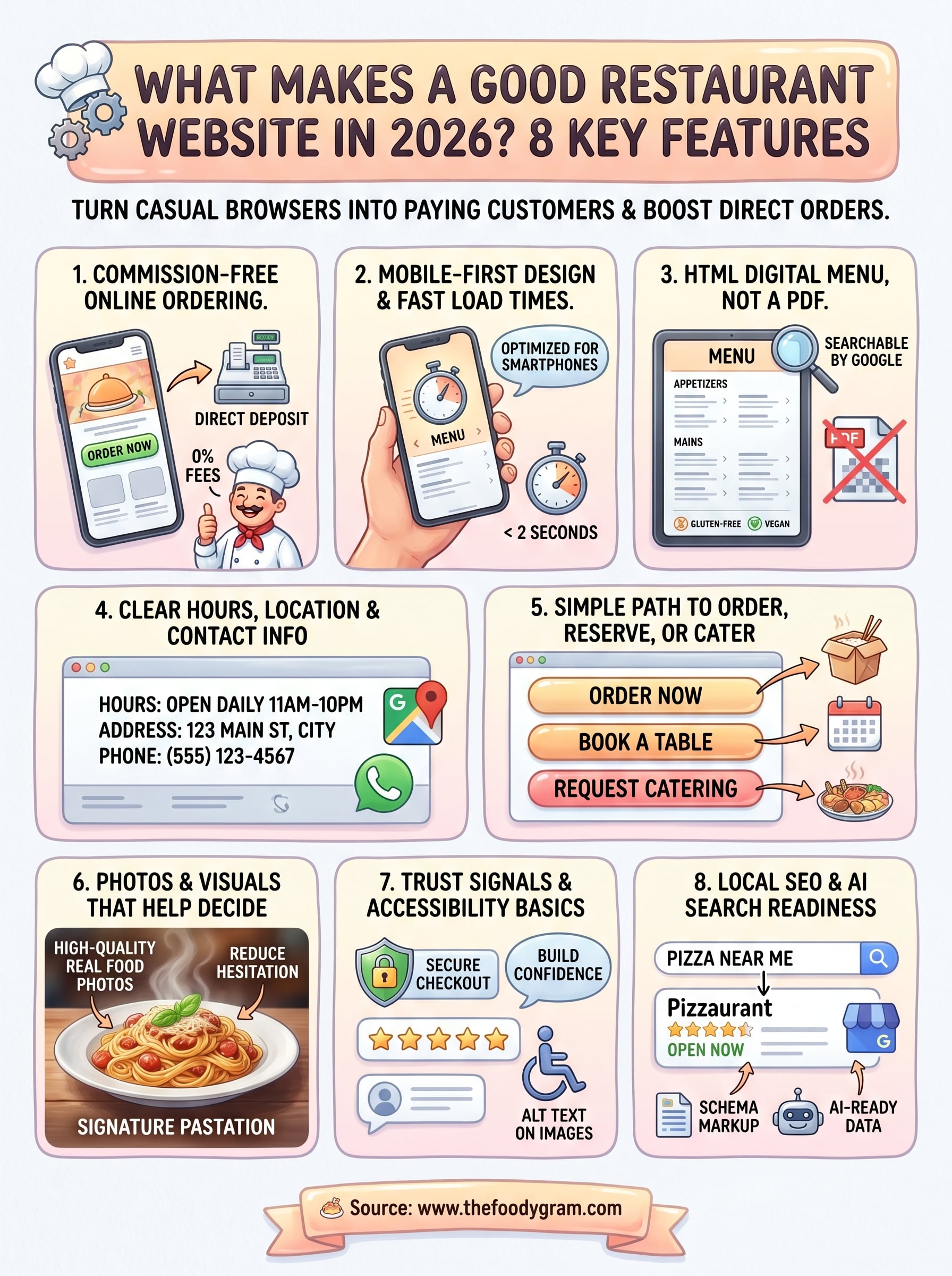
What Makes a Good Restaurant Website? 8 Key Features In 2026
Your restaurant's website is often the first thing a potential customer sees, before they ever walk through your door or place an order. So what makes a good restaurant website in 2026? It comes down to a handful of features that turn casual browsers into paying customers. Get those right, and your website becomes a revenue-generating machine. Get them wrong, and you're handing business to your competitors (or worse, to third-party apps that take 30% of every order).
At The Foody Gram, we build commission-free online ordering websites for restaurants across the U.S. We've seen firsthand what works, what doesn't, and what separates a site that collects dust from one that drives hundreds of direct orders every month.
This article breaks down the 8 key features every restaurant website needs right now, from mobile-first design to built-in ordering systems. Whether you're building your first site or rethinking the one you have, this list will give you a clear blueprint to follow.
1. Commission-free online ordering on your site
Online ordering is no longer a bonus feature. Customers expect to place an order directly on your website, and if they can't, they'll head to a third-party app where you lose up to 30% of every sale to commission fees. Built-in ordering on your own site is the single biggest lever you can pull to protect your margins and build a direct relationship with your customers.
What it does for guests and sales
A native ordering system keeps customers on your site from the moment they land to the moment they pay. That means fewer distractions, fewer drop-offs, and more completed orders going straight to your bank account. You also collect customer contact information directly, which lets you build a database you actually own and market to later.
Every order placed through a third-party app is a customer relationship you don't control.
What to include
Your ordering system needs to cover the essentials from the start. Make sure you have pickup and delivery options, real-time order confirmation, and a checkout flow that works without forcing customers to create an account. Support for pre-orders, catering requests, and digital wallets like Apple Pay and Google Pay should also be part of the package.
How to get it right in 2026
Customers in 2026 expect checkout to take under two minutes. Keep your ordering flow to three steps or fewer: choose items, review the cart, pay. A managed platform handles the technical setup for you, so your menu goes live quickly and stays accurate without requiring you to touch any code.
Common mistakes to avoid
The most common mistake is linking customers to a third-party platform instead of ordering through your own site. Another is using an outdated or clunky interface that breaks on mobile, which pushes customers to abandon the cart. Never make someone create an account just to place their first order.
Quick checklist
Use this to confirm your ordering setup covers the fundamentals before you launch:
- Pickup and delivery both supported
- Pre-order and catering options available
- Mobile-optimized checkout flow
- Digital wallet payment acceptance
- Direct deposit to your bank account
- Zero per-order commission fees
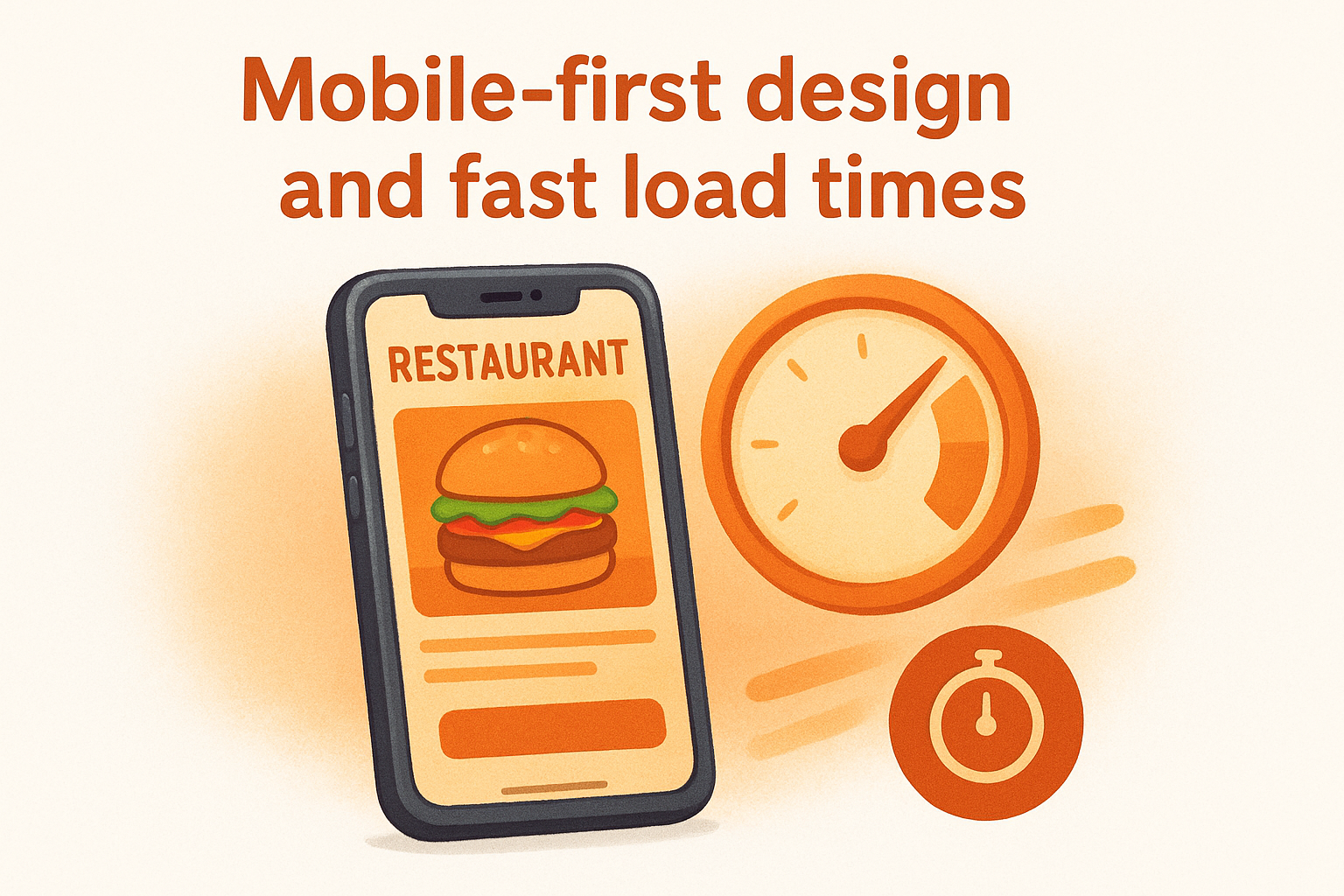
2. Mobile-first design and fast load times
More than 60% of restaurant searches happen on a smartphone. If your site isn't built with mobile as the priority, you're designing for a minority of your visitors and frustrating the majority before they ever see your menu.
What it does for guests and sales
A fast, mobile-optimized site reduces bounce rates and keeps customers moving toward an order. Google uses mobile performance as a ranking factor, so a slow or broken mobile layout costs you visibility in search results on top of lost sales.
A site that takes more than three seconds to load loses nearly half its visitors before a single page renders.
What to include
Your site needs responsive design that adjusts automatically to any screen size, compressed images that load quickly, and tap-friendly buttons sized for thumbs. Keep navigation simple: a mobile visitor should reach your menu or ordering page in one or two taps.
How to get it right in 2026
Use Google's PageSpeed Insights to test your load time and get specific fixes. Target a load time under two seconds on mobile. Managed restaurant website platforms handle image optimization and hosting performance automatically, so you don't need to manage technical details yourself.
Common mistakes to avoid
Uploading large, uncompressed images is the fastest way to tank your load time. Avoid building a desktop-first site and then shrinking it to fit smaller screens, because that approach creates a broken experience that pushes customers to close the tab.
Quick checklist
- Responsive layout that works on all screen sizes
- Load time under two seconds on mobile
- Tap-friendly buttons and simplified navigation
- Compressed, optimized images throughout the site
3. A digital menu page in HTML, not a PDF
A PDF menu might feel like the easy option, but it works against you on nearly every front. Search engines can't read PDF content, which means your dishes, ingredients, and prices are invisible to Google. Customers on mobile have to pinch and zoom just to find what they want, and that friction kills orders before they start.
What it does for guests and sales
An HTML menu page loads instantly, displays cleanly on any screen, and gives Google something it can actually index. When someone searches for "spicy tuna roll near me," a properly structured HTML menu gives your site a real shot at appearing in those results. PDFs get none of that benefit, and this is one of the clearest answers to what makes a good restaurant website.
Your menu is your most visited page. Build it so search engines and customers can both use it without friction.
What to include
Your menu page needs clear category sections (appetizers, mains, drinks, desserts), item names, short descriptions, and prices. Add allergy information and dietary labels like gluten-free or vegan directly on the page, not buried in a separate document.
How to get it right in 2026
Keep your menu updated in real time whenever items change or go seasonal. A managed platform lets you request updates without touching code, so your site always reflects what you actually serve.
Common mistakes to avoid
Uploading a scanned or image-based menu creates the same problem as a PDF. Avoid walls of text with no visual separation between categories, as that sends customers straight off the page.
Quick checklist
- HTML-based menu, not a PDF or image file
- Clear category headers and item descriptions
- Pricing and dietary labels visible on the page
- Mobile-friendly layout with easy scrolling
4. Clear hours, location, and contact info everywhere
When someone finds your website, they often have one immediate question: "Can I order from you right now?" If your hours and address are buried or missing, that customer moves on. Thinking about what makes a good restaurant website often starts with flashier elements, but basic contact information is what turns a site visitor into a paying customer.
What it does for guests and sales
Visible contact information removes friction at the exact moment a customer is ready to act. When your hours are easy to find, people don't call your staff to ask simple questions, which saves your team time and keeps the phone line clear for real orders.
A customer who can't confirm your hours in under ten seconds will find a competitor who makes it easier.
What to include
Put your hours, address, and phone number in the footer of every page and on a dedicated contact page. Include a Google Maps embed so customers can get directions without leaving your site.
How to get it right in 2026
Keep your hours current across your website, Google Business Profile, and social channels at the same time. Inconsistent information across platforms confuses customers and damages your local search ranking.
Common mistakes to avoid
Hiding your address or phone number behind a contact form is a fast way to lose customers. Also, outdated holiday hours on your site will send customers away confused.
Quick checklist
- Hours, address, and phone in the footer on every page
- Dedicated contact page with full details
- Google Maps embed for easy directions
- Holiday and seasonal hours updated promptly
5. A simple path to order, reserve, or cater
A confusing site layout costs you sales before a customer ever reaches checkout. Every visitor who lands on your site has a specific action in mind, and your job is to get them there in as few clicks as possible.
What it does for guests and sales
A clear, direct path to order, reserve, or request catering removes the hesitation that kills conversions. When customers can act immediately without hunting around your site, they complete their goal faster, and your average order volume rises as a result.
Friction is the enemy of completed orders. Every extra click you add is a customer you risk losing.
What to include
Your homepage needs prominent calls to action for each service you offer: online ordering, reservations, and catering inquiries. Link each button to a dedicated page or form so customers land exactly where they need to be with no extra navigation required.
How to get it right in 2026
Place your primary call-to-action button above the fold so it's visible without scrolling on both desktop and mobile. Keep button labels direct: "Order Now," "Book a Table," and "Request Catering" convert far better than vague labels like "Learn More."
Common mistakes to avoid
Burying your reservation or catering link in the footer is one of the most common errors on restaurant sites. Thinking through what makes a good restaurant website means putting every key action front and center where customers can find it immediately.
Quick checklist
- Order, reserve, and cater buttons visible on the homepage
- Each button links to a dedicated page or form
- Above-the-fold placement for your primary call to action
- Direct, action-oriented button labels throughout
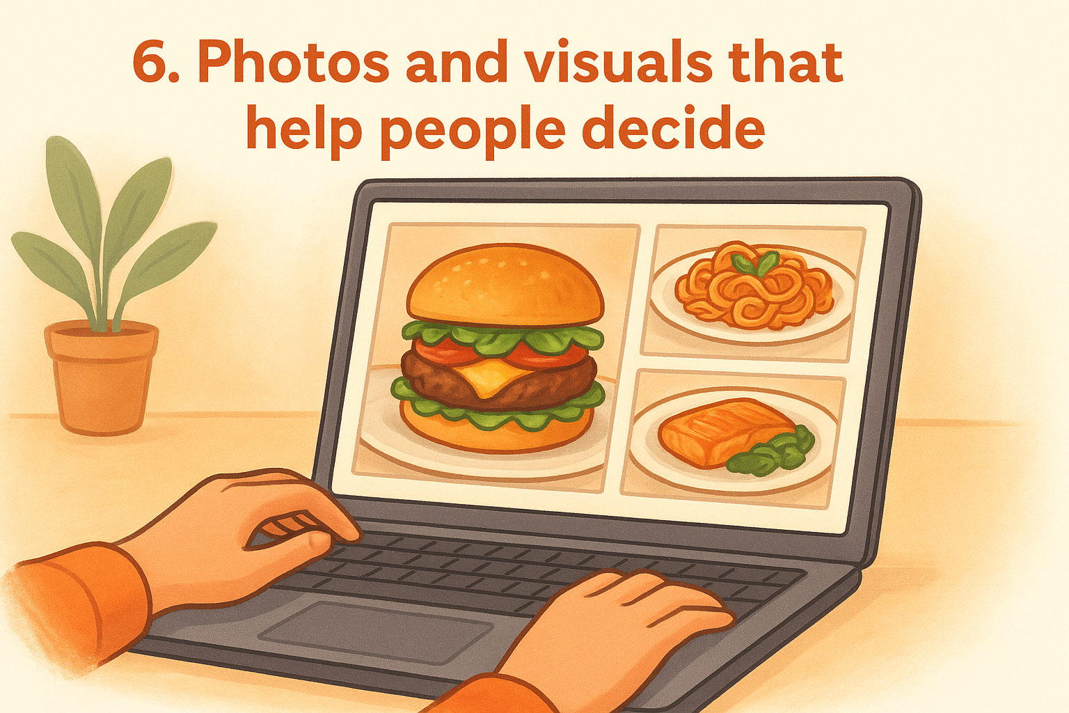
6. Photos and visuals that help people decide
People eat with their eyes first. When someone lands on your site without knowing your restaurant, high-quality food photography can be the difference between a new customer and a bounce. Visuals are one of the most overlooked answers to what makes a good restaurant website, but they directly influence whether someone places an order or closes the tab.
What it does for guests and sales
Strong visuals reduce purchase hesitation. When a customer can see exactly what a dish looks like, they feel more confident placing an order, and that confidence translates into higher average order values and fewer abandoned carts.
A single compelling photo of your best dish does more selling than a paragraph of description ever will.
What to include
Your site needs real photos of your actual food, not stock imagery. Include shots of your dining room or pickup area, and a short team photo if it fits your brand. Show your most popular dishes prominently on the homepage and ordering page.
How to get it right in 2026
Natural lighting and a clean background go a long way even on a smartphone camera. Compress every image before uploading to keep load times fast, and use descriptive file names that support your local SEO efforts.
Common mistakes to avoid
Avoid using blurry or poorly lit photos that make food look unappetizing. Dark, overcrowded shots hurt conversions just as much as having no photos at all.
Quick checklist
- Original food photography from your actual menu
- Dining room or pickup area visuals included
- Compressed images optimized for fast loading
- Most popular dishes featured on the homepage
7. Trust signals and accessibility basics
A first-time visitor decides whether your site feels trustworthy within seconds. Missing trust signals and poor accessibility hurt your conversion rate and cost you orders. Knowing what makes a good restaurant website means making sure customers feel safe placing an order and can navigate your site without friction.
What it does for guests and sales
Visible trust signals like customer reviews and a secure checkout badge reduce hesitation before a purchase. Accessible design opens your site to more customers, including those with visual or mobility limitations who would otherwise leave without ordering.
What to include
Display Google or Yelp reviews on your homepage alongside a visible SSL indicator and any food safety certifications your restaurant holds. Your site also needs sufficient color contrast, readable font sizes, and alt text on every image to meet basic accessibility standards.
A site that looks secure and reads cleanly earns the confidence that turns a cautious visitor into a repeat customer.
How to get it right in 2026
Review Google's web accessibility guidance to identify and fix gaps on your site. Prompt customers to leave a review after each order so your ratings stay current and credible.
Common mistakes to avoid
Skipping alt text on images hurts both screen reader accessibility and your search rankings at the same time. An expired SSL certificate triggers browser security warnings that stop customers before they ever reach your menu.
Quick checklist
- Customer reviews displayed on the homepage
- SSL certificate active and current
- Alt text on all images
- Color contrast and font sizes meeting accessibility standards
8. Local SEO and AI search readiness
When someone searches "pizza near me" or asks an AI assistant for restaurant recommendations, your site's local SEO signals determine whether your name shows up. Understanding what makes a good restaurant website in 2026 requires thinking beyond design and into how search engines and AI tools discover and present your business.
What it does for guests and sales
Strong local SEO puts your restaurant in front of customers who are already ready to order. AI-powered search tools like Google's Search Generative Experience pull business details directly from your site and your Google Business Profile, so restaurants with accurate, structured data get recommended more often.
The restaurants that show up first in local and AI search results capture customers before competitors ever get a chance.
What to include
Your site needs location-specific keywords woven naturally into your page titles, headings, and menu descriptions. Add structured data markup (schema.org) for your restaurant name, address, hours, and cuisine type so search engines can read and display your details accurately.
How to get it right in 2026
Keep your Google Business Profile fully updated with current hours, photos, and your direct ordering link. Match every detail on your site to what appears on your Google listing to avoid conflicting signals that hurt your ranking.
Common mistakes to avoid
Skipping schema markup leaves search engines guessing about your details. Inconsistent NAP data (name, address, phone) across your site and listings undermines your local ranking and pushes potential customers toward restaurants with cleaner information.
Quick checklist
- Location keywords in page titles and headings
- Schema markup for restaurant name, address, hours, and cuisine type
- Google Business Profile linked to your direct ordering page
- Consistent NAP data across all platforms
Next steps
Now you know what makes a good restaurant website in 2026: built-in ordering, mobile-first design, an HTML menu, clear contact info, simple navigation paths, strong visuals, trust signals, and local SEO. Each feature on this list works together to turn your site into a tool that brings in direct orders instead of sending customers to third-party apps that take a cut of every sale.
The good news is you don't have to build any of this from scratch. The Foody Gram sets up your branded restaurant website with commission-free ordering in 48 to 72 hours, handles your menu updates, and gives you a system that works for your margins from day one. There are no setup fees and no long-term contracts, just a flat monthly rate with a 45-day money-back guarantee. Check out our restaurant website plans and pricing to find the right fit for your restaurant.