

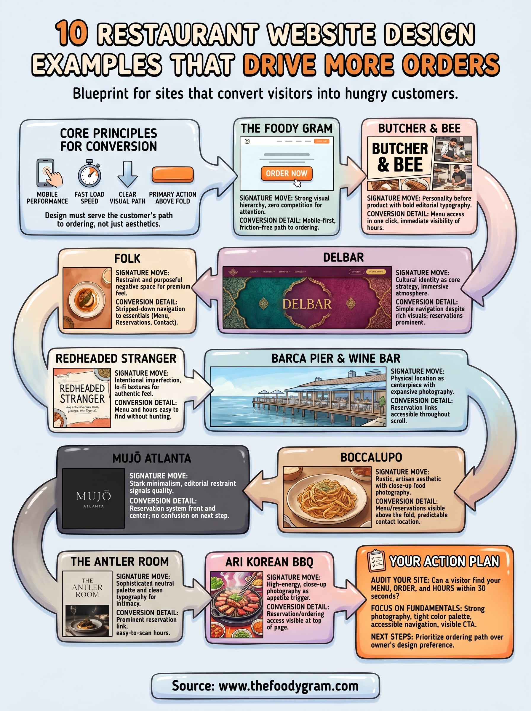
10 Restaurant Website Design Examples That Drive More Orders
Your restaurant's website is doing one of two things right now: bringing in orders or turning people away. There's not much middle ground. The difference almost always comes down to design, how your site looks, how it functions, and how easily a hungry customer can go from browsing your menu to placing an order. That's exactly why studying strong restaurant website design examples matters before you build or redesign your own.
We put this list together because at The Foody Gram, we build restaurant websites and commission-free online ordering systems every day. We've seen firsthand what makes a restaurant site convert visitors into paying customers, and what causes people to bounce straight to a third-party app. The patterns are consistent, and they're worth paying attention to.
Below, you'll find 10 restaurant websites that get it right. For each one, we'll break down what works, why it works, and how you can apply those same principles to your own site. Whether you're starting from scratch or rethinking what you already have, these examples give you a concrete blueprint for a website that actually drives orders.
1. The Foody Gram
The Foody Gram's own site does exactly what it tells restaurants to do: put the customer path first and make ordering as friction-free as possible. If you're studying restaurant website design examples to build something better, this one gives you a strong baseline because it's built entirely around conversion, not just visual appeal. The site is clean, fast-loading, and structured so visitors immediately understand what the platform offers and what step to take next.
Signature design moves worth copying
The design leans on strong visual hierarchy and intentional white space. Headlines are short and direct, the color palette stays consistent throughout, and the layout pulls your eye from the main value statement down to the call-to-action button without detours. Nothing on the page competes for attention in a way that pulls visitors away from the intended action. Each section earns its place by moving the visitor one step closer to making a decision.
A clear visual path from first impression to action is what separates a site that converts from one that just looks good.
Conversion details that matter
Every section of the site serves a specific role in the customer journey. The homepage opens with a core benefit, backs it up with credibility signals, and places the primary prompt exactly where visitors are most ready to act. Mobile performance is built in from the start, not added as an afterthought, which matters because most restaurant customers browse on their phones. Buttons are large enough to tap easily, text stays readable without zooming, and the path to ordering never requires unnecessary clicks.
How to recreate this style on your site
You don't need a complicated setup to get similar results. Focus on three fundamentals: a clear main message, fast load speed, and one primary action per page. Your menu and order button should appear above the fold on any screen size. Pick a tight color palette that reflects your restaurant's personality, use real food photography instead of generic stock images, and write your page headlines to answer the question a hungry visitor is already thinking: "Can I order here, and how quickly can I get my food?"
Get those fundamentals right, and your site will already outperform most of your local competition.
2. Butcher & Bee
Butcher & Bee runs a website that leads with personality before product, which makes it stand out among restaurant website design examples that tend to look interchangeable. The site uses bold, editorial-style typography paired with candid food and kitchen photography that feels lived-in rather than staged. From the first scroll, you get a clear sense of who this restaurant is, not just what it serves.
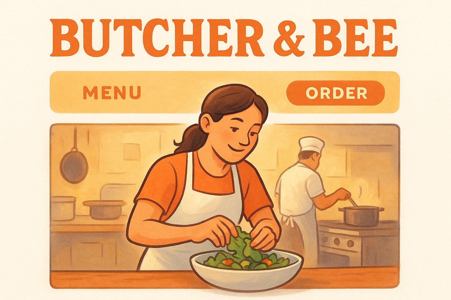
Signature design moves worth copying
The site commits to a consistent visual identity across every page. The typeface choices are distinctive and carry through from the navigation to the menu headers, creating cohesion that reinforces the brand. Rather than leaning on stock images or flashy animations, Butcher & Bee lets strong type and real photography carry the experience.
A clear typographic identity can communicate your restaurant's personality before a visitor reads a single word of body copy.
Conversion details that matter
Menu access sits within one click from the homepage, which keeps hungry visitors moving toward an order rather than hunting through nested pages. The site also makes location and hours immediately visible, cutting down on the friction that pushes people to leave and search elsewhere. Both of those choices protect the path to conversion.
How to recreate this style on your site
Pick one or two distinctive typefaces and use them consistently across every page. Pair that with photography showing your actual kitchen, staff, or dishes rather than generic stock images. Consistent typography and authentic photography together build the kind of trust that turns a first-time visitor into a repeat customer.
3. Folk
Folk's website earns its place among the best restaurant website design examples by doing something most restaurant sites avoid: restraint. The Nashville wood-fired pizza spot uses a warm, neutral palette and minimal text to create a site that feels calm and deliberate rather than crowded. From the first moment on the page, the design signals quality without overstating it.
Signature design moves worth copying
The site leans heavily on full-bleed imagery that stretches edge to edge, giving food photography maximum impact without needing elaborate layouts. Negative space is used purposefully throughout, allowing each visual element to breathe and pull the visitor's focus exactly where it needs to land. The overall effect is a site that feels premium without relying on flashy elements.
Restraint in design often communicates confidence, and confident brands build customer trust faster than busy, cluttered layouts do.
Conversion details that matter
Folk keeps its navigation stripped down to only the essential pages: menu, reservations, and contact. This simplicity removes the decision fatigue that causes visitors to leave without acting. Hours and location appear without requiring any digging, which protects the path from first visit to actual reservation or order.
How to recreate this style on your site
Start by cutting any page element that doesn't serve a clear purpose. If a section doesn't help a visitor find your menu, place an order, or contact you, remove it. Use high-resolution photos with consistent warm tones to tie the visual experience together, and let the images carry the storytelling weight.
4. Delbar
Delbar's website stands apart from most restaurant website design examples by treating cultural identity as the core design strategy. The Atlanta-based Middle Eastern restaurant uses deep jewel tones, warm gold accents, and layered textures to create an immersive first impression that tells visitors exactly what kind of experience is waiting for them inside.
Signature design moves worth copying
The site builds atmosphere through color and texture rather than lengthy copy. Every visual element, from the dark backgrounds to the ornate pattern details, reinforces the cultural story Delbar is telling. This coherence across every page is what gives the site a sense of intentionality that most restaurant websites miss.
When your design reflects the actual experience inside your restaurant, visitors arrive with accurate expectations, and accurate expectations lead to stronger reviews and more repeat visits.
Conversion details that matter
Despite the visually rich approach, the site keeps navigation simple. Reservations and menu links appear prominently, so visitors drawn in by the atmosphere can act on that interest immediately. Location and contact details sit exactly where visitors expect them, cutting the friction that typically interrupts the decision to book a table.
How to recreate this style on your site
Start by identifying two or three visual elements that represent your cuisine or concept: a color, a pattern, or a texture. Apply those consistently across your header, section backgrounds, and menu page. Pair that visual consistency with clear, accessible navigation, and you will build a site that earns both attention and action from first-time visitors.
5. Redheaded Stranger
Redheaded Stranger, the Austin wine bar and restaurant, earns its place among the best restaurant website design examples by committing fully to its counter-culture identity. The site uses hand-drawn type, earthy tones, and lo-fi textures that tell visitors within seconds that this place has a genuine point of view rather than a generic restaurant template.
Signature design moves worth copying
The site treats intentional imperfection as a design tool. Rough-edged illustrations and informal typography communicate warmth and authenticity in a way that overly polished layouts simply cannot replicate.
Every visual choice connects back to the brand's core personality, which keeps the entire site feeling cohesive even though the aesthetic is unconventional by industry standards.
Leaning into your restaurant's actual personality, even when that personality is rough around the edges, produces a more memorable site than chasing what looks "professional."
Conversion details that matter
Despite the casual visual approach, Redheaded Stranger keeps menu access and hours easy to find without making visitors hunt. The relaxed aesthetic never sacrifices the practical information people need.
Contact details sit exactly where users expect to find them, so the distinctive design style never becomes a barrier between a curious visitor and the next step they need to take.
How to recreate this style on your site
Start by identifying what makes your restaurant different from every other spot nearby, then build every design decision around that single idea. Choose textures, hand-drawn elements, or unconventional typefaces only if they genuinely reflect your concept.
Apply that identity consistently across every page so the personality carries through from your homepage to your menu to your contact section.
6. BARCA Pier and Wine Bar
BARCA Pier and Wine Bar uses its waterfront location as the centerpiece of its entire website experience. Among restaurant website design examples that lean on atmosphere, BARCA stands out by letting expansive photography of the pier setting and water views do most of the heavy lifting before a visitor reads a single line of copy.
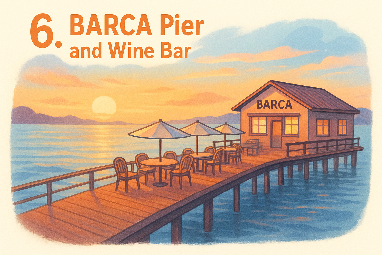
Signature design moves worth copying
The site builds its visual identity around the physical location itself, using wide landscape shots that capture the pier, the surrounding water, and the ambient lighting that defines the dining experience. Full-width hero images anchor each major section, giving the design an open, airy feel that mirrors what guests actually encounter when they arrive in person.
When your restaurant has a physical setting that people will travel for, your website photography should show that setting first and your menu second.
Conversion details that matter
BARCA keeps reservation links visible and accessible throughout the scroll, so visitors inspired by the scenery can act on that impulse without backtracking to find the button. Contact details and operating hours appear in a clean, straightforward footer, which cuts the friction between interest and actually booking a table.
How to recreate this style on your site
Start by identifying one defining feature of your restaurant's physical space, whether that's an open kitchen, a rooftop patio, or a distinctive interior aesthetic, and build your homepage photography around that single element. Pair those location-specific images with simple, accessible navigation to keep the path from inspiration to reservation as short as possible for every visitor who lands on your site.
7. Mujō Atlanta
Mujō Atlanta's website reflects exactly what the restaurant is: a precise, intimate omakase experience that communicates exclusivity without being unwelcoming. Among restaurant website design examples rooted in Japanese aesthetics, Mujō stands out by using stark minimalism and deliberate pacing to set visitor expectations before anyone even reads a word of copy.
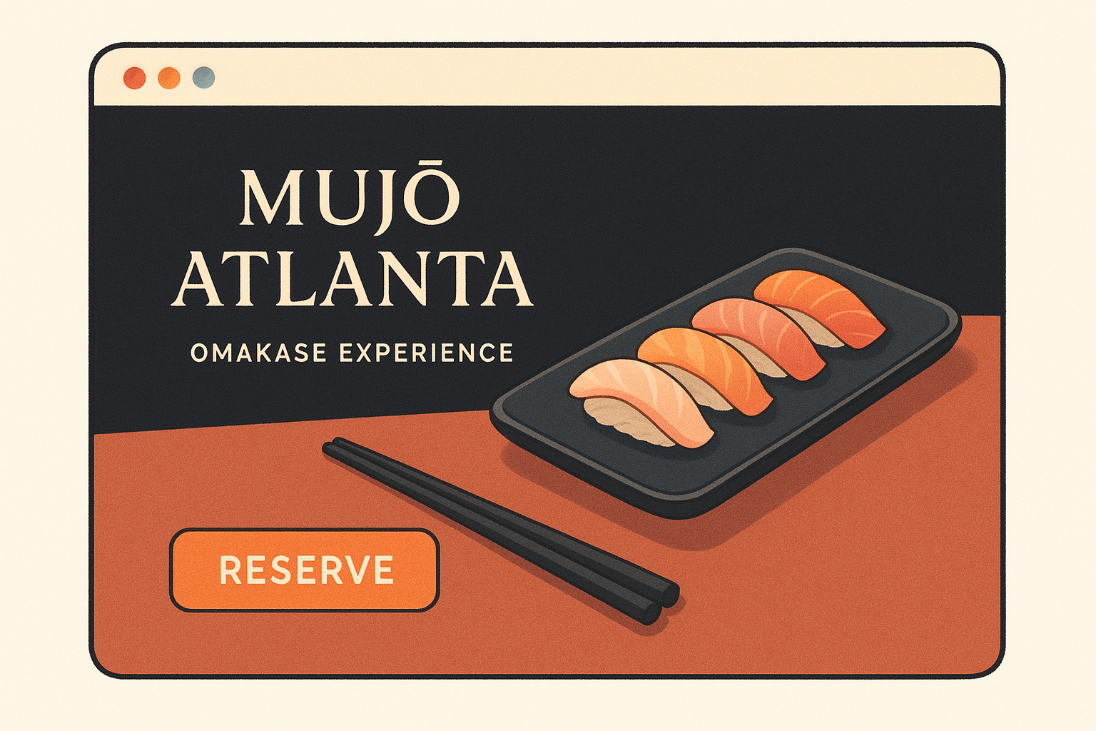
Signature design moves worth copying
The site uses dark backgrounds with sparse, elegant typography to create a sense of ceremony from the first scroll. Every image is selected and placed with precision, reinforcing the idea that every detail inside the restaurant receives the same level of care.
Very few elements compete for attention on any given screen, which forces visitors to focus exactly where the restaurant wants them to look. This level of editorial restraint signals quality in a way that lengthy menu descriptions never could.
A minimalist design approach can communicate the quality of your experience more effectively than a page full of descriptions ever could.
Conversion details that matter
Mujō keeps its reservation system front and center because that's the only action the restaurant needs visitors to take. Contact information and location details appear exactly where guests expect them, without requiring extra clicks or unnecessary scrolling.
There's no confusion about what step comes next on any page. The streamlined navigation ensures that visitors drawn in by the atmosphere can act on that interest immediately.
How to recreate this style on your site
Focus on one primary action you want visitors to take and build every design decision around making that action easy to find. Strip back your color palette to two or three tones that reflect your restaurant's atmosphere, and use photography that captures the precision your dining experience actually delivers.
8. BoccaLupo
BoccaLupo, the Atlanta Italian pasta spot, earns its place among strong restaurant website design examples by pairing a rustic, handcrafted aesthetic with practical design decisions that make ordering and reservations genuinely straightforward. The site captures the intimate, neighborhood feel of the restaurant without sacrificing the clarity visitors need to act.
Signature design moves worth copying
BoccaLupo builds its visual identity around warm earth tones and artisan-style typography that immediately communicate the handmade ethos behind the food. The photography focuses on close-up shots of finished dishes, pulling visitors into the tactile, sensory experience of the restaurant before they ever walk through the door.
Authentic close-up food photography communicates craft and care far more effectively than wide-angle dining room shots alone.
Conversion details that matter
The site keeps menu access and reservation links visible without requiring visitors to scroll past the fold, which protects the conversion path for anyone arriving hungry and ready to act. Contact details and hours sit in a predictable location, so visitors never have to hunt for the basic information that drives a dining decision.
How to recreate this style on your site
Start by pairing two or three warm tones that reflect your kitchen's personality with typography that feels intentional rather than generic. Invest in close-up food photography that highlights texture and detail, because that kind of imagery does more to communicate quality than any amount of descriptive copy. Keep your navigation tight, and make sure menu access stays within one click from wherever a visitor lands on your site.
9. The Antler Room
The Antler Room in Kansas City brings the same quiet confidence to its website that it delivers to its tasting menu. Among refined restaurant website design examples, this one earns attention by using a sophisticated neutral palette and carefully chosen editorial photography to communicate intimacy and intention before a visitor reads a single line of menu copy.
Signature design moves worth copying
The site pairs muted tones with clean, serif typography to create a visual tone that matches the restaurant's small-format, chef-driven identity. Photography focuses on low-lit, close-up food shots that capture the precision behind each dish rather than the size of the dining room.
When your photography matches the actual atmosphere inside your restaurant, visitors arrive with expectations your team can meet and exceed.
Conversion details that matter
The Antler Room keeps its reservation link prominent and accessible throughout the page, so visitors inspired by the imagery can act immediately without searching for a booking option. Hours and contact details appear in a clean, easy-to-scan format, which removes the friction that typically sends interested guests elsewhere before they commit to a reservation.
How to recreate this style on your site
Focus on two or three neutral tones that reflect your dining room's actual lighting and atmosphere, then build your photography around that palette. Pair those images with one clear serif typeface used consistently across your homepage, menu page, and contact section. Keep your reservation or ordering link visible on every scroll position so a visitor never has to hunt for the next step.
10. Ari Korean BBQ
Ari Korean BBQ closes out this list of restaurant website design examples by showing how a cuisine-specific concept can use bold color and energetic food photography to turn a website into an appetite trigger. The site channels the communal, high-energy experience of Korean BBQ directly through its visual presentation, so visitors immediately understand what they're walking into before they ever reserve a table or place an order.
Signature design moves worth copying
The site leans on vibrant, close-up photography of sizzling proteins and banchan spreads to communicate the full sensory experience of the restaurant. Color choices stay consistent and warm throughout, reflecting the heat and energy of tabletop grilling without crossing into visual noise that distracts visitors from taking action.
When your cuisine has a built-in visual identity, your photography should reflect that experience as directly and honestly as possible.
Conversion details that matter
Ari Korean BBQ keeps reservation and ordering access visible at the top of the page, so visitors who are ready to act never have to scroll to find the button they need. Hours, location, and contact details appear in a clean, easy-to-scan format that removes the friction between curiosity and commitment for first-time visitors.
How to recreate this style on your site
Focus on photography that captures your food in its most dynamic moment rather than static, overly staged plating shots. Use two or three bold accent colors pulled directly from your cuisine's visual palette to tie your pages together, and keep your call-to-action button visible from every scroll position so no visitor has to hunt for the next step.
Next Steps
Every restaurant website design example on this list shares one underlying principle: the design serves the customer's path to ordering, not the restaurant owner's preference for how their site looks. Strong food photography, a tight color palette, accessible navigation, and a visible call-to-action button are not optional extras. They are the baseline for any site that drives real orders rather than just traffic.
Your next move is to audit your current site against what you saw here. Ask whether a first-time visitor can find your menu, place an order, and confirm your hours within 30 seconds of landing on your homepage. If the answer is no, the site is costing you revenue every single day.
The Foody Gram builds commission-free restaurant websites designed specifically to convert visitors into customers. Take a look at our restaurant website plans and pricing and see what a site built around ordering can do for your bottom line.